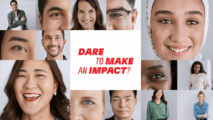
We helped the festival shine brighter—with inclusive creative, smart strategy, and 30,000 smiling faces.
The Project
Vancouver International Children’s Festival is an annual event for children that brings in talent and visitors from all across the globe. They were looking to us to develop a concept and campaign with key visuals to promote the event for their diverse visitors and donor audiences.
Our unique approach
Deliverables
- Community Engagement Research
- Analysis and Insights Reporting
- Creative Ideation and Implementation
- Campaign Ideation and Messaging Strategy
- Consultation
ID: A campaign image of two children against a white background promoting the Vancouver International Children’s Festival. The child on the left who is masculine-presenting with short black hair, olive skin, and wearing a lime green sweatshirt, is depicted in a cheerful running pose. The child on the right side who is feminine-presenting, light beige skin and long blonde hair, is dressed in a purple dress, glasses, pink scrunchy, black leather jacket, and is shown dancing and having fun with their arms stretched out. Both children are surrounded by childlike drawings on a white backdrop of a snowman, hearts, musical notes, and other graphic elements.
ID: The festival poster shown on a tablet, being held by a parent. The advertisement features illustrations and text, promoting the Vancouver International Children’s Festival. A child in a green shirt, depicted as a cartoon-style snowman waving, is on one side of the panel. A different child on in the middle is drawn as a fairy in a pink shirt, holding a magic wand and wearing a crown. The child on the right is drawn dancing while wearing glasses, a scrunchy, leather jacket, and a purple dress. The text “Ignite your child’s playful joy” is visible in purple. Details of the event are listed just below. The style of the illustrations is child-like and whimsical, with drawings of flowers, stars, and other decorative elements. The background of the advertisement is white.
“Add a quote here from the client if one exists. If there isn’t, we can maybe try getting one from the internal team who was involved in the project who wants to celebrate a success, avoiding only celebrating the client.”
Person's Name
Position, Organization
“We enlisted AndHumanity's expertise to assist us in strategizing, developing, and overseeing an inclusive and diverse campaign for our Festival. Their involvement resulted in the creation of a comprehensive strategy that not only effectively positioned our Festival but also offered valuable insights that we continue to use today. The resulting campaign not only fulfilled our immediate needs but also established a solid foundation for future extensions and adaptations. Throughout our collaboration, our team gained valuable insights from AndHumanity's JEDI lessons and approach. Their refreshing and thoughtful process ensures lasting solutions for their clients. We wouldn't hesitate to collaborate with them again in the future.”
— Joanna Da Silva, Marketing Manager